A recent round of client work at One Mighty Roar has got me thinking a lot more about successful interface design. Specifically, how can we build pages that send a clear message without losing aesthetic or professional edge? The question turns out not to be “How does it look?†but, “What is it saying?â€
Dazzling graphics can lose the thrill over time, but a clearly worded page has lasting power.
I came to a realization. There are very few group interactions with the internet. It’s rare for more than one person to use the same computer and browse a website together. There are obviously times when everyone in your office gathers to watch a cute cat video on YouTube, but you get the idea. This one-to-one relationship has a few important implications:
You only have to care about one person at a time. That’s a powerful direction.
Interaction is Personal
A one-to-one interaction with a visitor is low risk. With nobody is watching over your shoulder and rating your interactions, there is no pressure to fake understanding. It’s like asking your best friend to explain something to you â€" they’ll be direct and conversational. With this type of relationship, a visitor’s ego and reputation can stay untouched. This is why blogs are such a great way to learn new skills, the process is judgement-free and failing doesn’t hurt.
In recent years, the trend has been to replace the standard “Welcome†to a more personalized “Helloâ€. This is a step in the right direction. As Darren Hoyt recently wrote about in “Designing with Social Skills“, interfaces should be designed for humans.
A large company probably won’t want to greet visitors in the same way that a designer does on his portfolio. There’s a level of professionalism that needs to be maintained, and the larger the entity represented, the more important the tone. I firmly believe that it is possible to show professionalism without sacrificing a personalized conversation with the user. Not every visitor is going to be a potential investor with an MBA. But if they were, would it even matter? Business professionals are people at the end of the day too, after all.
Readability MattersJason Fried said it best with “Copywriting is Interface Design“. A button’s label has just as much (if not more) impact as the design of the button itself. In the one-to-one relationship that visitors have with a site, phrasing and reading level can be considered convienences of an interface. This is why tools like After The Deadline are so important with web copy. These kinds of services consider the implications of grammar on comprehension, and not just technical mistakes.

It’s always suprised me how more service-oriented sites don’t include a “reading level†button right next to the font size options. Isn’t it just as important to understand the content as it is to see the letters clearly? The message of “If you don’t understand this, you shouldn’t be here†is a barrier to interface design. It’s a free excuse to ignore real problems.
The “About Us†page is not a collegiate thesis paper nor is it a first-grade picture book. The problem is that of those two extremes, sites are more likely to fall into the “professionalism†trap of overdesigned sentences. On the other hand, when’s the last time you wished a site used bigger words?
How to Chart ReadabilityReadability of the English language can be measured using a number of tests. For example, the Flesch-Kincaid rates readability by grade level and is calculated using a combination of words, syllables, and sentence structures. The Automated Readability Index is another popular method.
Try This: Google Docs has a few of these measures built in by default, but for a quick test try using this online tool. Put some of your own work to the test. Are you overdesigning sentences?
Wording Can Be SelfishWhen I’m on a website, I don’t care about “The Site Policyâ€, but I do care how it affects me. Headings and copy can afford to be selfish, because that’s probably what they care most about. Be self-centered on behalf of the visitor, and you’ll be surprised at how well the results come out.
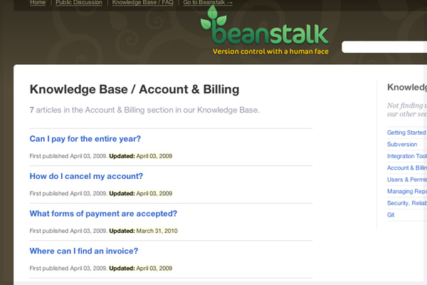
Lessons from FAQThe average Frequently Asked Questions page is a great reference for this. One of the reasons that FAQ pages work so well is because they phrase problems in terms of the user. Rather than “Billing Policyâ€, the FAQ becomes “How will I be billed?†Wording is concrete and in relation to the user instead of some abstract idea. It’s all about you.

Let’s use Beanstalk’s service documentation as an example. They make heavy use of personalized language to present common questions. Would their documentation be as effective without it? Most likely, but the real added value is much more subtle. The Beanstalk folks have shown that they realize people (not robots) use the service. These are people that would rather get things done instead of feel a false sense of professionalism from decoding overdesigned sentences.
If an idea can be done in a single sentence, why not?
What About You?What’s your take on successful interfaces? Assuming a page layout is successful, how do you keep communication clear? If you have feedback or suggestions that you’d like to share on this, please let us know in the comments below.
Resource & Further ReadingFor those interested in a little more.
Powered by WizardRSS | Full Text RSS Feeds
